
Brand Crush: Nutrition Stripped
Having a cohesive and consistent brand presence is so important when it comes to building recognition and trust!
This has become more challenging as our brands are not longer just contained to a website and a business card. It stretches far beyond that into every touch point we have with our clients, fans and future customers - our social media platforms, our websites and even our own personal branding and photography.
In this post, I have deconstructed wellness blog, Nutrition Stripped. It's a fine example of a brand that is consistent and cohesive, while maintaining the freedom to be creative!
Brand Crush: Nutrition Stripped

A Fresh & Modern Aesthetic
When I first stumbled on McKel Hill's beautiful business, Nutrition Stripped (NS), I fell in love with the clean, fresh and modern aesthetic of here site. She is a fresh young face on a mission to help people feel good through great food and nutrition.

McKel's mission is as clear and fresh as her brand!
Color Palette and Fonts
The NS brand shies away from what we have usually come to expect of wellness brands (green, organic textures and fonts), and goes straight for a classic modern feel.
This feeling is expertly conveyed using classic black and white as the underpinning color palette.
It is subtly reflected across all her branding and quite frankly, it's sublime!
It's the "Audrey Hepburn" of the nutrition world!
The logo supports this aesthetic with the pairing of a classic serif and sans serif font in a simple black.
The serif font over a white background strip is applied throughout the site and doesn't get in the way of the messaging. Not to mention, it is also a super easy application for someone who is not a designer to apply to all their graphics.


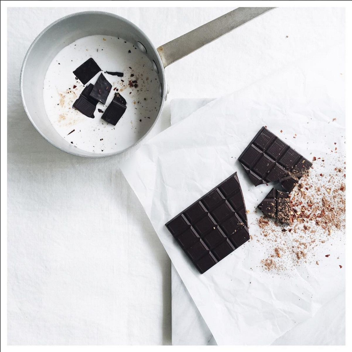
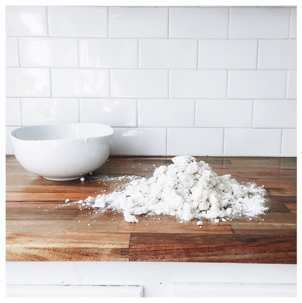
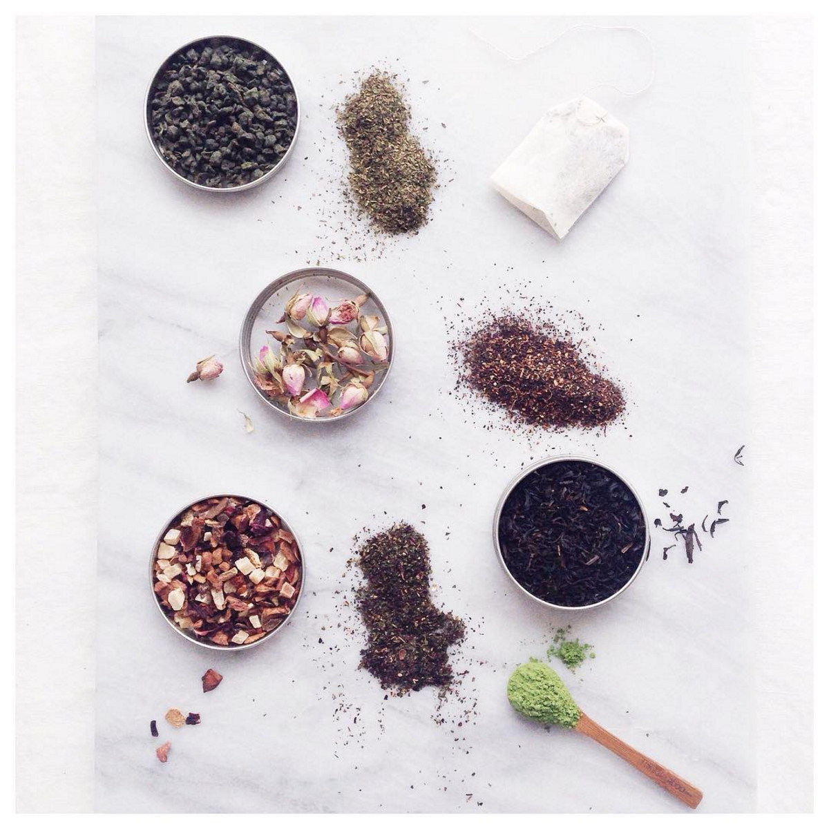
Photography & Styling
From McKel's headshots, where she dons a black and white striped shirt, to the way she photographs her food, there is brand consistency and cohesiveness throughout.
Clean, crisp white marble trays or white fabrics or tiles are the mainstay of her imagery throughout.
Personal Branding
You can see when you scroll through McKel's photos that she literally lives and breathes her brand.
From the clothes she wears to the way she decorates her home, to the color of her bike, it's fresh, modern and almost always black or white!
This is wonderful evidence that her brand is effortlessly authentic to her.


Social Media
I think social media is probably one of the hardest platforms to get right from a branding perspective. You have to strike a careful balance between the spontaneity of social media and carefully curated content to achieve brand consistency (lots of C's in that one - phew).
In McKel's case, I think the authenticity of her brand makes this task a little easier, but she does go the extra mile and the attention to detail, while subtle, shines through.
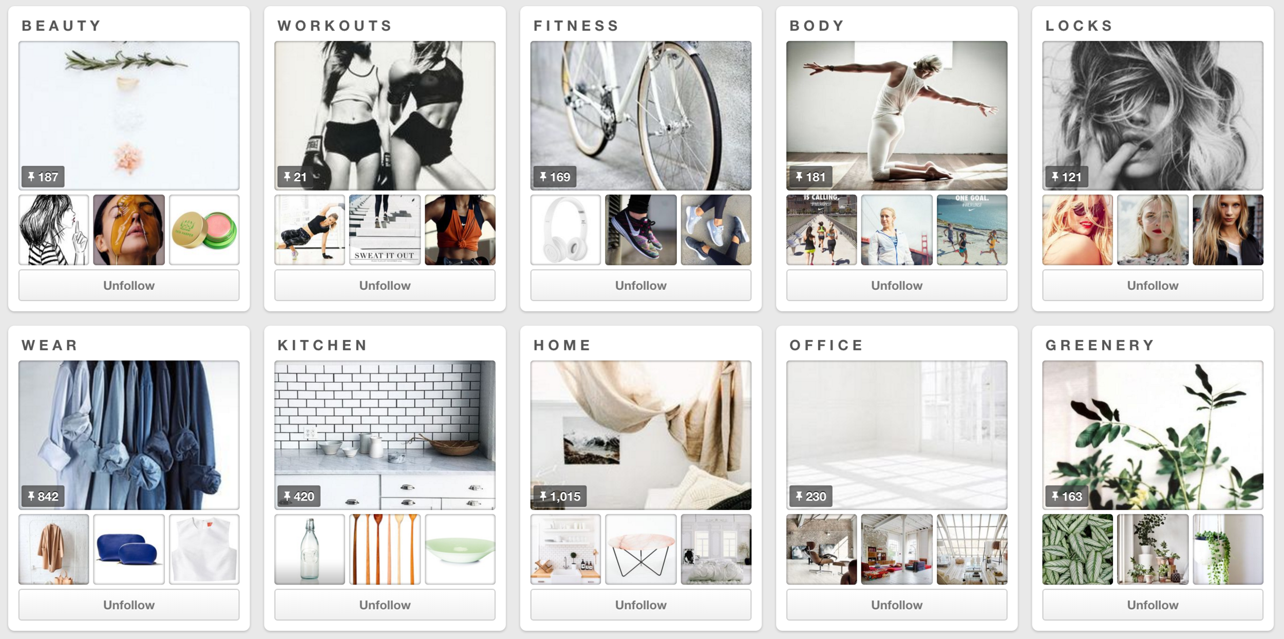
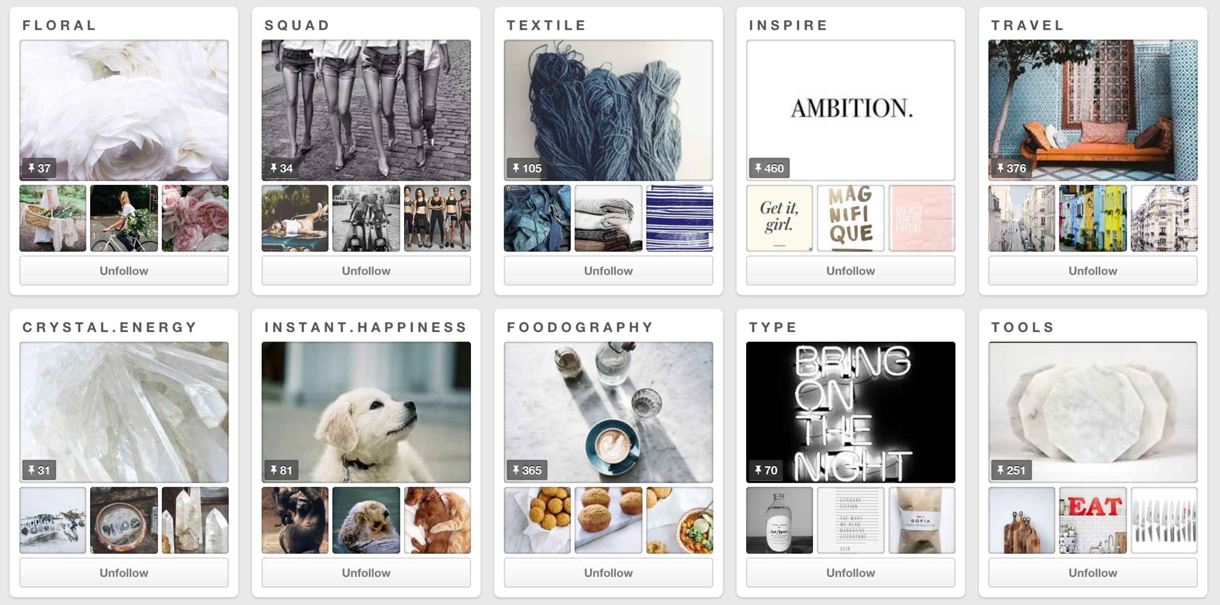
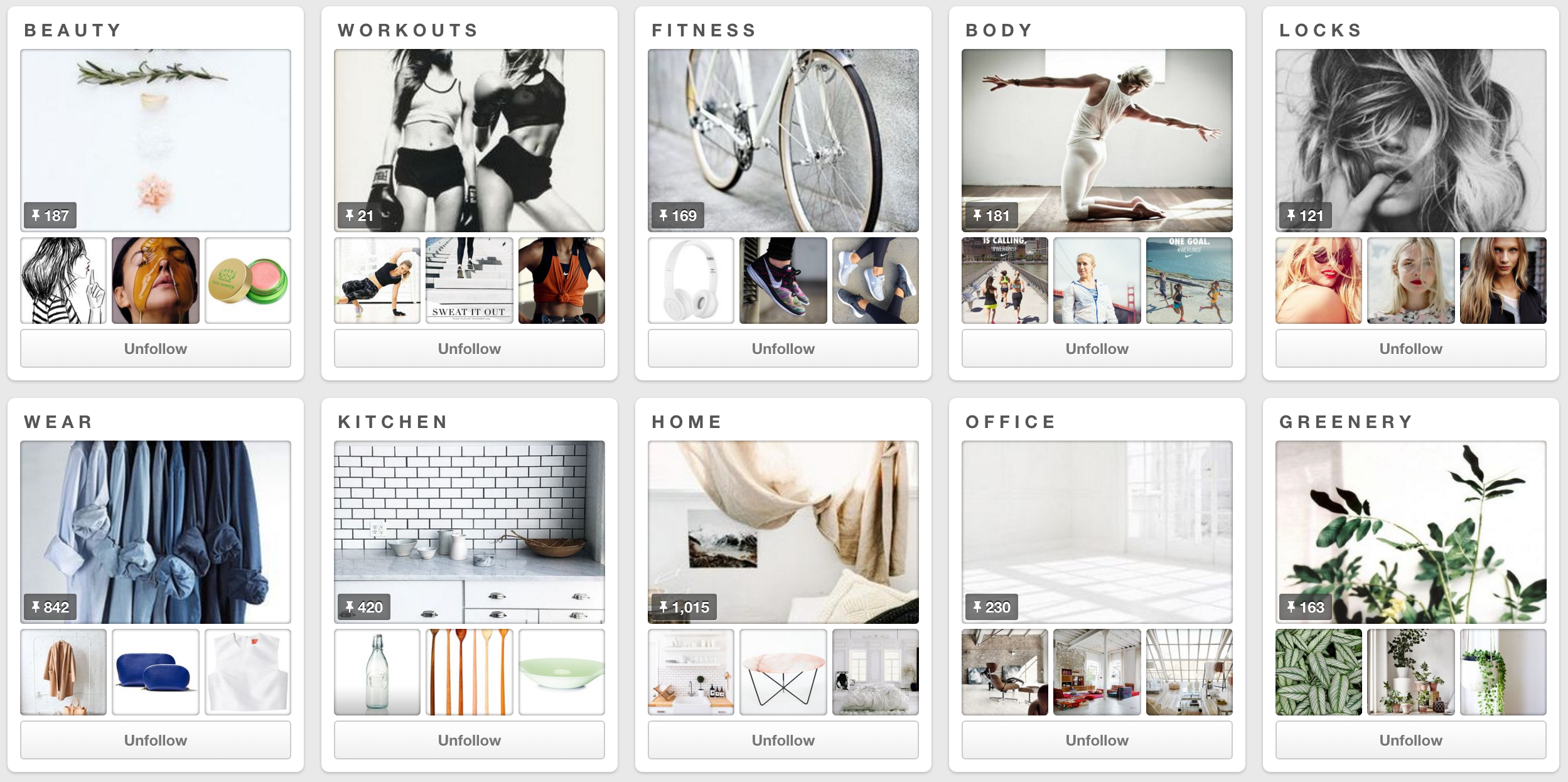
An example of this can be found in her Pinterest boards.
Each board, whether deliberately or by happy coincidence, clearly reflects her brand. By selecting main images on each of her boards that pay homage to her black and white theme, the overall look and feel of her Pinterest account is spot on.
McKel also writes all the titles of her board in all caps and with a spacing in between each letter. Once again, subtle but oh so right.
McKel's Instagram account has the same wonderful theme and consistency.

Final thoughts
Brands take time and effort to build - from a personal as well as a design point of view. The more authentic and natural your brand is to YOU, the easier this becomes.
Nutrition Stripped is one example of a brand that is cohesive, consistent and authentic. I absolutely LOVE it!
All images on this post were sourced from the Nutrition Stripped website and Pinterest account.
Building A Cohesive Brand: Checklist
- STRONG + CLEAR VISION: When it comes to building a cohesive brand presence, it's important to have a very strong and clear vision for your brand. What you stand for, who you serve and what that looks like visually.
- BRAND PERSONALITY: Do you have an idea of the type of brand personality you want to convey. Are you bold, modern, tribal, bohemian, earthy?
- COLOR PALETTE: Do you have a strong color palette and aesthetic that can easily be represented throughout your brand.
- FONT SCHEME: Do you have a font scheme that you can carry through your blog and social media posts.
- TOUCH POINTS: Have you thought about all the different touch points (online and physical) with your potential clients and what message you are conveying with your brand. This could be in your client onboarding processes, invoices, emails. By doing a quick brand audit, you will soon see whether your brand is cohesive!
- CONSISTENCY: Is your brand CONSISTENT throughout all of this.
- STYLE GUIDE: Do you have a Brand Style Guide in place. A style guide is one of your brands most important assets. By having your brand elements and guidelines clearly outlined, it makes it easy to keep your brand on track - whether you are designing your graphics or you are outsourcing to a graphic designer. Your Style Guide is your brand's best friend.